9 Best Practices for Designing Form Layouts in 2025
Are you looking for the best form layouts to improve your login and registration forms?
Login and Registration forms are essential to any website to collect user data. However, poorly designed forms can frustrate users and lead to incomplete submissions.
To ensure that your login and registration forms are easy to use and effective, following best practices for form design is important. These practices will help you create intuitive, user-friendly, and optimized login and registration forms for your site.
In this article, we’ll show you some best practices for designing form layouts for your login page. So, without much ado, let’s get started!
Table of Contents
What is the Form Layout?
The form layout includes arranging and organizing form elements such as text fields, checkboxes, buttons, dropdown menus, and other interactive elements on a web page or login form.
The form layout is critical in ensuring the form is easy to use and understand. Moreover, it helps you collect all the necessary information from the user accurately and efficiently.
It’s worth noting that a good form layout is intuitive, user-friendly, and visually appealing. It has a clear hierarchy of elements and logical grouping of related fields. A carefully handed form creates a positive user experience and achieves high form completion rates.
Why Does Form Layout Matter?
A well-designed form layout can help to improve the user experience, increase form completion rates, and ensure that you collect accurate and useful data from your users.
Here are some key points that let you add the benefits of a well-designed form layout:
- Reduced User Errors: A well-structured login and registration form reduces the likelihood of user errors. Clear labels and proper field placement guide users, minimizing mistakes and the need for corrections.
- Increased Form Completion Rates: Users are more likely to finish the process when a login and registration form is user-friendly and easy to complete. This leads to higher completion rates.
- Improved usability: A well-designed login and registration form layout can make it easier for users to understand what information is needed on their part. Clear labels, intuitive placement of fields, and logical flow reduce confusion and frustration, making the process more user-friendly.
- Improved Effectiveness: Carefully designing the layout for your login and registration forms enhances the overall user experience. Users who find the process straightforward are more likely to complete the form accurately. This, in turn, increases form completion rates and leads to more accurate data collection.
- Better Data Quality: A clear and logical layout for login and registration forms helps minimize user errors. It ensures that the data collected is accurate and complete.
- Time-saving: An intuitive form layout can reduce the time users need to complete a form. It improves the user’s overall experience and increases engagement with your form.
Note: A responsive form layout adjusts seamlessly to different screen sizes, i.e., tablets, desktops, and smartphones.
See our guide on How to Create a Mobile-Friendly Login Page Using LoginPress for providing responsive login and registration forms.
9 Best Practices for Designing Form Layouts
1. Use a Single-Column Layout
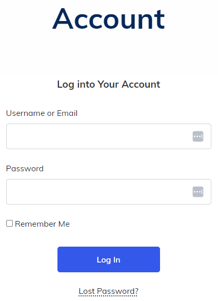
A single-column layout is a popular design choice for many websites. This layout presents login information fields in a linear, easy-to-follow format suitable for desktop and mobile devices.
2. Indicate Which Fields Are Optional
It’s worth noting that many users want to fill in less information when filling out a form. They might be in a rush or want to share as little information as possible.
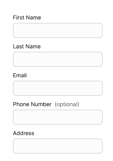
So, it’s recommended to be clear about which fields are optional. Indicating which fields are optional on a login form can improve the user experience by providing clarity, saving time, avoiding errors, and increasing transparency.
Here’s a super simple example.
3. Remove All Non-Essential Fields
A login form with too many fields can be overwhelming and confusing for users. Removing non-essential fields makes the form simpler and easier to use, improving the user experience.
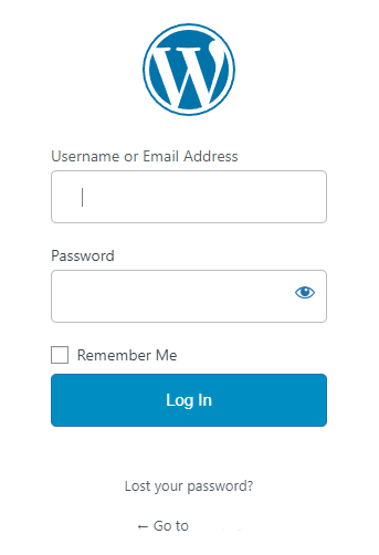
When users are presented with a login form that requires them to fill out many non-essential fields, they may be more likely to abandon the process altogether. Removing non-essential fields can increase the likelihood of users completing the login process, ultimately increasing conversion rates.
See an example for a perfect form.
4. Use Proper Labels
It’s a good practice to use labels imperative for accessibility. Screen readers communicate each label to users. Without proper labeling, forms are inaccessible to many people.
Note: It’s best to avoid long labels. It makes the forms easy to read and scan.
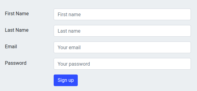
5. Add Inline Form Field Labels
You can add inline field labels and text, making it exceptionally easy for visitors to understand where to place their responses in your forms.
Inline form field labels are positioned within the form fields, making it clear to users what information is required in each field. It can be useful for users relying on screen readers or other assistive technologies.
6. Give People a Reason to Use Your Form
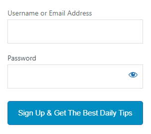
There are many reasons why you should give people a reason to use your WordPress form. Here are some of the most important ones:
Providing a compelling reason for users to use your WordPress form is recommended. It improves user experience, collects more data, builds trust, and generates leads.
7. Make Error Messages Crystal Clear
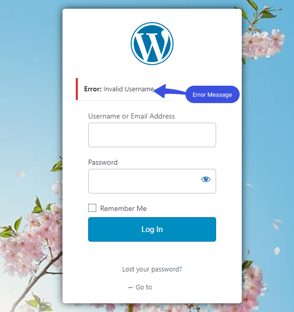
When users encounter an error on a form, they need to know exactly what went wrong and how to fix it. So, a clear error message helps the users understand the issue and take the necessary steps to correct it, which improves the overall user experience.
Users may become frustrated and abandon the form altogether if they encounter unclear error messages. It can lead to losing potential leads or customers, which is detrimental to businesses.
Here is a fine example of a clear error message:
8. Make the Call-to-Action (CTA) as Specific as Possible
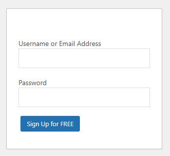
Call-to-Action (CTA) button is important in creating effective WordPress forms. It encourages users to take action and submit the form, so making it as specific as possible is essential.
It’s better to observe some key tips for crafting a particular CTA for your WordPress forms, including action-oriented language, clear and concise language, etc.
Here is an example:
9. Create a Mobile-Friendly Layout
In today’s mobile-first world, having a mobile-friendly layout for your WordPress forms is the best option. A mobile-friendly layout ensures your forms look great and are easy to use on mobile devices.
A mobile-friendly layout helps you to increase form submissions and conversions. Creating and testing a mobile-friendly form on different mobile devices is better to ensure they look and function correctly.
Why LoginPress is the Best Login Page Customizer Plugin
Note: We assume you have already installed and activated LoginPress.
LoginPress is one of the best login page customizer plugins. It helps you modify each element on the login page without writing a single line of code.
It’s worth noting that it lets you customize the look and feel of your login page and helps you boost your site security.
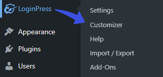
LoginPress enables you to customize the login form layout fully. To do this, go to the left side of the admin dashboard, navigate to LoginPress, and click on the Customizer option.
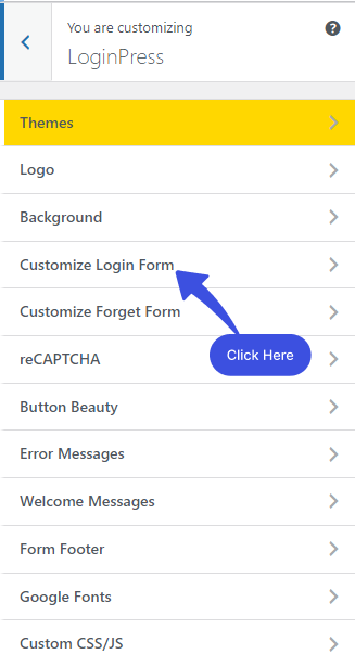
A new screen with all of the Customization Options will open up. Select the Customize Login Form option.
After clicking on the Customize Login Form option, a new window will open where you’ll get all the customization options. Along with the LIVE Preview, to instantly track the changes made to the Login Form.
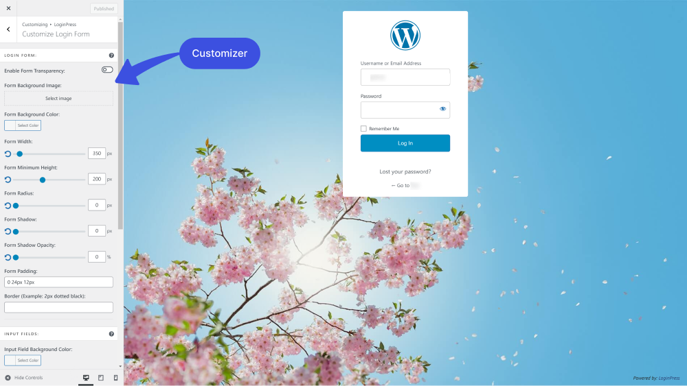
Let’s see what you can design form layout with LoginPress:
1. Enable Form Transparency: You can make your Login Form transparent in seconds with the LoginPress Enable Form Transparency feature.
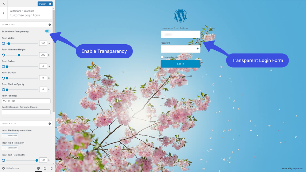
2. Form Background Image: You can easily add the form background image.
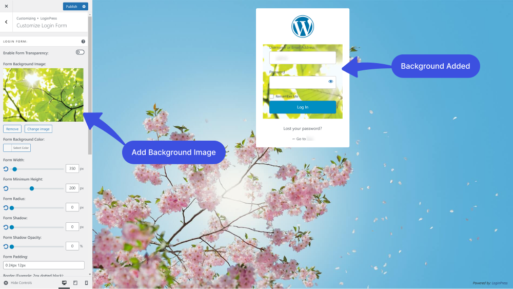
3. Form Background Color: Are you done with the default WordPress form background color? It’s pretty easy with the LoginPress Form Background Color feature.
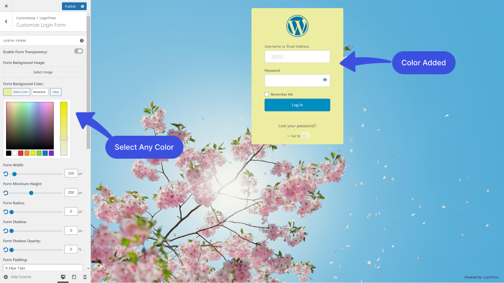
4. Form Width: You can customize the width of the form.
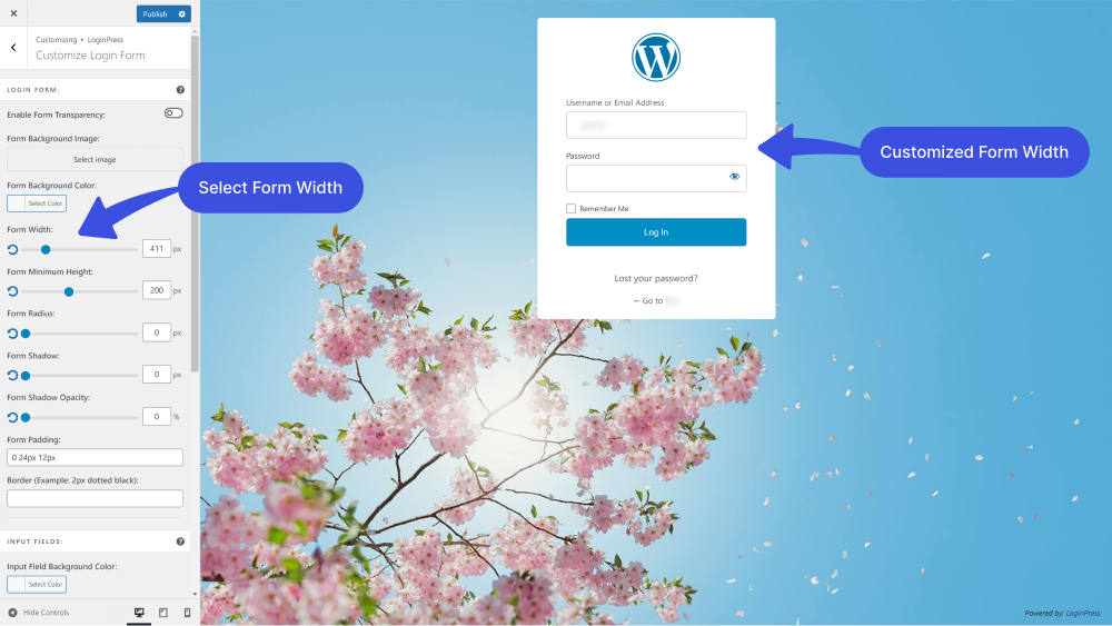
5. Form Minimum Height: The Form Minimum Height feature lets you customize the height of the login form.
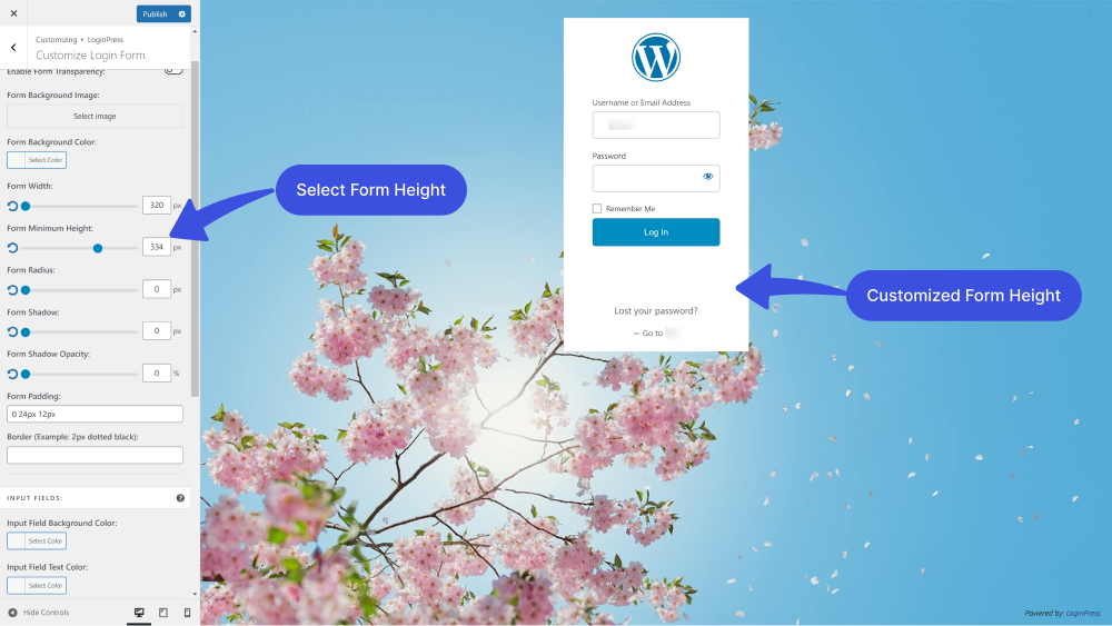
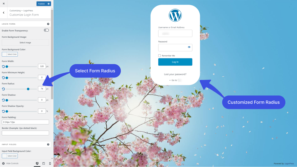
6. Form Radius: LoginPress lets you choose the perfect corner Radius for your Login Form, i.e., square or rounded. It impacts the overall feeling of the interface of your Login Form.
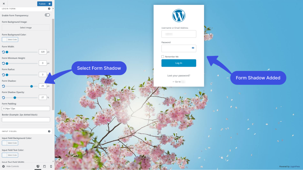
7. Form Shadow: The Form Shadow feature lets you add a shadow to your Login Form. The shadow takes on the same rounded or square corners for your buttons as you’ve selected for the Login Form radius.
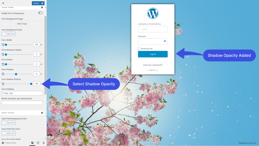
Note: You can see the Shadow effect if you enable the Form Opacity.
8. Form Opacity: You can use the Customize Login Form feature to edit the shadow opacity of the Login Form.
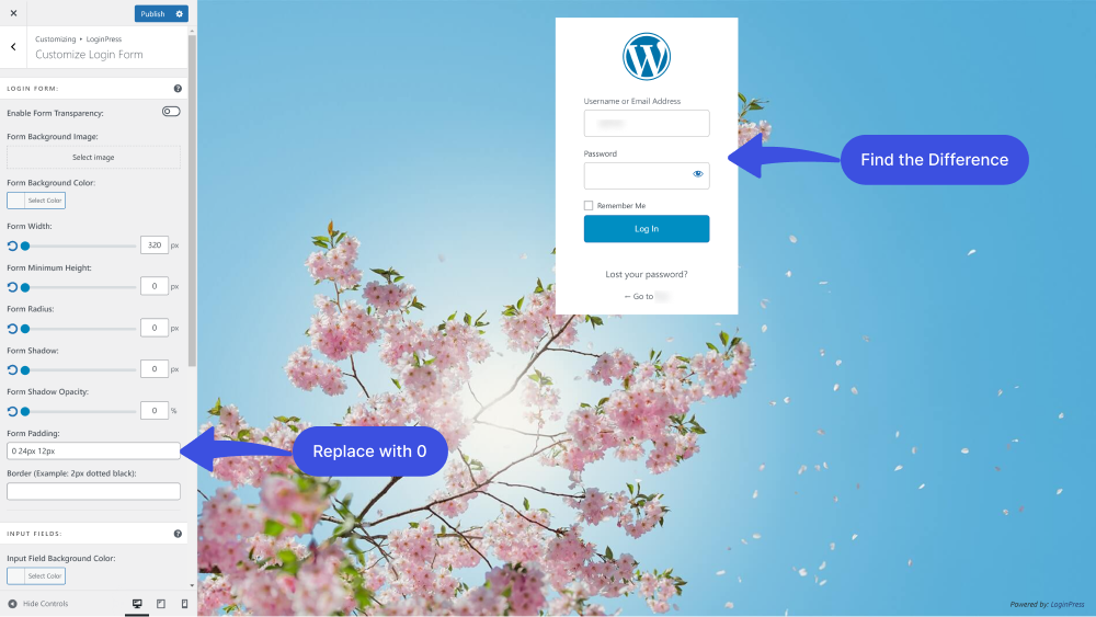
9. Form Padding: You can add form padding.
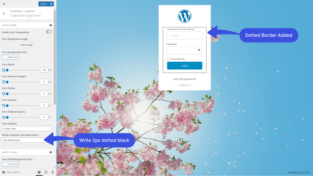
9. Border: You can simply add a customized border on the Login Form by writing “2px dotted black” in the Border input field.
Note: You can change the border color by changing “black” to any color you choose.
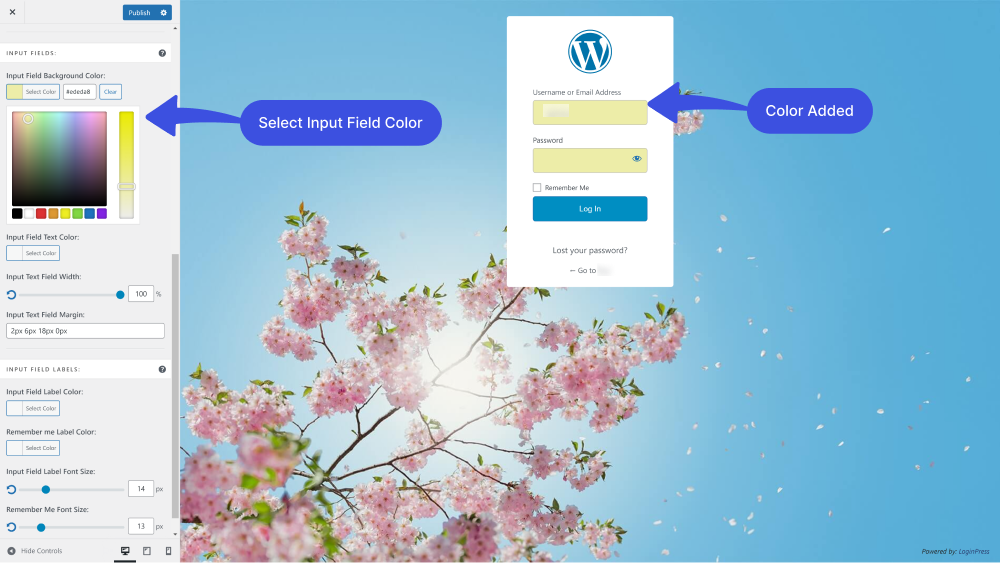
10. Input Field Background Color: You can easily customize the input field background color on the Login Form using the Input Field Background feature.
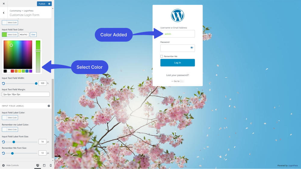
11. Input Field Text Color: LoginPress lets you add Input Field Background Text color.
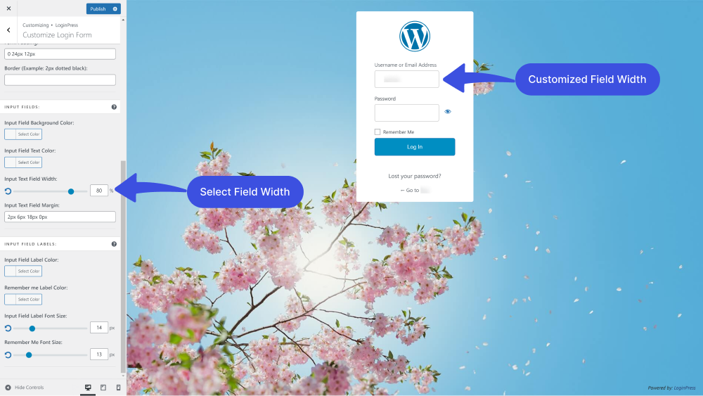
12. Input Text Field Width: You can even customize the width of the input text field.
13. Input Text Field Margin: You can customize the Input Text Field Margin further.
Note: You can change the numbers in the “2px 6px 18px 0px” to make the exact look the way you want the text field margin.
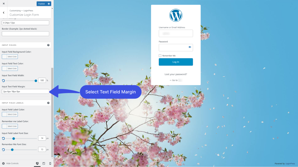
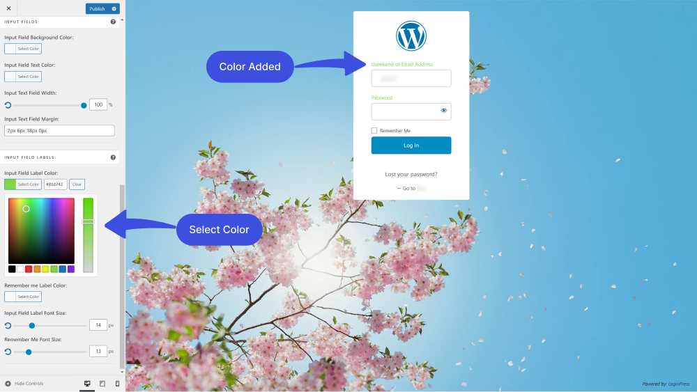
14. Input Field Label Color: You can add different input field label colors without writing a single line of code.
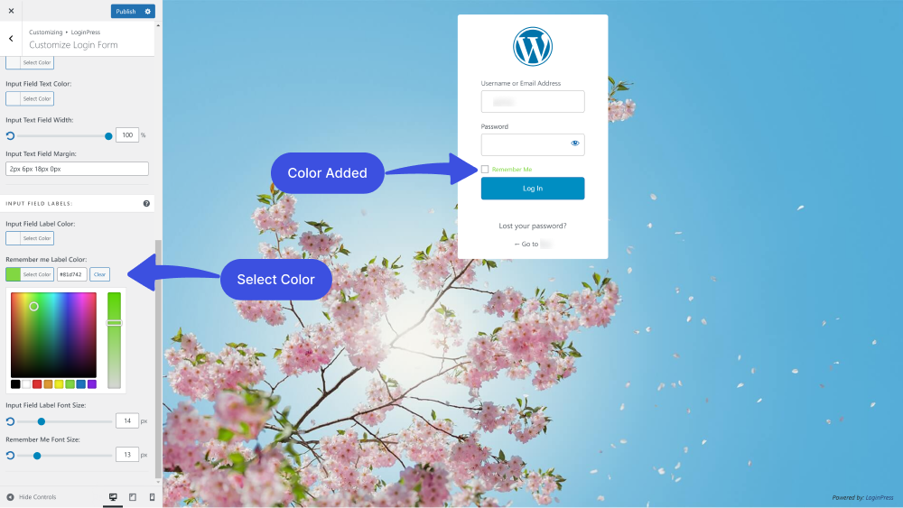
15. Remember me Label Color: You can further change Remember Me label color with the help of the LoginPress Remember me Label Color feature.
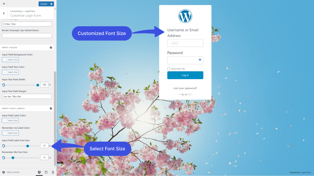
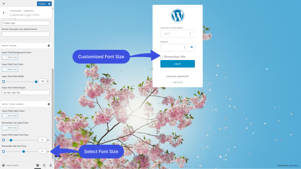
16. Input Field Label Font Size: The LoginPress Input Field Label Font Size feature lets you customize its size. You can make it smaller or bigger simply by using range control.
17. Remember Me Font Size: By default, WordPress Remember Me font also has a specific size. The LoginPress Remember Me Font Size feature lets you easily customize its size without writing a single line of code.
Form Layout FAQs
Why is form layout design important?
Form layout design directly impacts user experience. If you have a well-designed form, it will make it easy to navigate and understand it. It will increase higher submission rates of your forms.
What are the principles of form designing?
Form design plays an important role in creating the user experience. So you must observe some design principles, including keeping your form simple, asking only what’s necessary, single-page layout, and always ordering your form fields from easy to hard.
How many fields should a form have?
There is no hard and fast rule for how many fields a form should have, but it’s generally best to keep the number of fields to a minimum. Only ask for necessary and relevant information for the purpose of the form.
What is the best way to handle long forms?
It’s important to break long forms into smaller sections and provide clear navigation to allow users to move between sections easily. You can also use progress indicators to show users how much of the form they have completed.
Should I observe any guidelines for a good form design?
Yes, make sure to build an easy-to-fill form; it should fulfill the purpose for which they are designed. make sure that the form provides an accurate completion, and don’t forget to make it attractive.
Conclusion
The form layout is critical to the overall user experience. Proper attention should be given to its design to ensure users can quickly and effectively complete the form.
Based on the 9 Best Practices for Designing Form Layouts, it is clear that designing a user-friendly form layout requires careful attention to detail. By following these practices, designers can create forms that are easy to navigate, clearly communicate the necessary information, and minimize errors.
By incorporating these best practices into their form design process, designers can create more efficient, user-friendly, and effective forms for collecting the necessary information.
You can also check out our guides on
- How to Create a Mobile-Friendly Login Page Using LoginPress
- How to Add Custom CSS to WordPress Login Screen.
That’s all!
How much has our article helped you design a user-friendly login form layout?
Let us know by leaving a comment below.

