13 Best Login Page Examples to Inspire Your Own Design
Are you looking for the best login page examples for the login page of your WordPress site?
A login page is essential for your website. A creative and attractive login page quickly catches visitors’ attention and drives more traffic to your website.
In this article, we’ll show you some of the best WordPress login page designs you can use for the login page of your WordPress site.
Let’s get started!
Table of Contents
Why Do You Need to Design a Login Page?
The login page design helps you create an attractive page for visitors. The problem with the default WordPress login page design is that it’s the same for all websites.
Look what a generic WordPress login page design looks like:
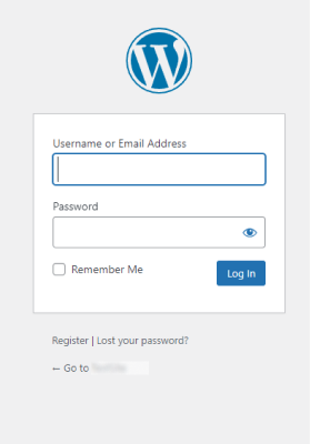
As you can see, aside from the WordPress logo, the page has got nothing in the way of colors, branding, and background images. So, there is no way of knowing which website you will log in to when you fill out the form and click Log In.
On the other hand, you can see an example below of a custom WordPress login page design.
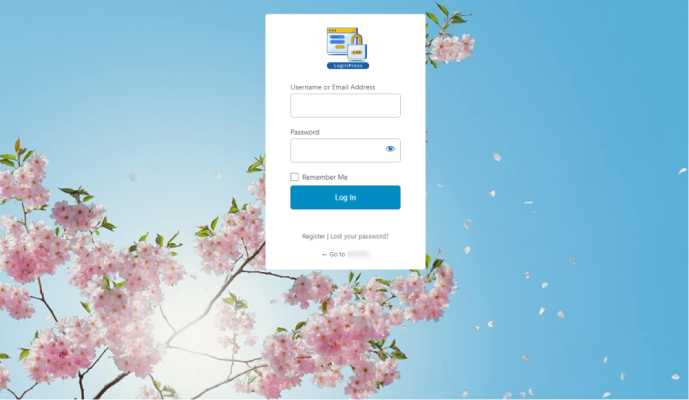
The first thing you’d notice is the beautiful background image that covers the entire screen. Next, you can see the brand’s logo at the top of the form. The custom login page immediately distinguishes your login pages from the competition. The form is also stylized and could be further customized to fit the rest of the website’s design.
What Should a Login Page Have?
First, your login page must have essential elements, including a login form, Register, and a Forgotten Password link.
This is not it! You can also make your login page more inviting, and it’s a good idea to include some of the following things:
- There has to be your business log.
- You can add social login buttons.
- Using headlines and content to explain the page’s purpose is better.
- A Signup form for unregistered users.
- Eye-catching colors
13 Best WordPress Login Page Design Examples
Here, we’ve shared 14 login page examples that we love. You can get ideas from the following designs when you are about to customize your login page!
1. LoginPress
LoginPress is a feature-packed WordPress login page customizer plugin that takes all the hassle away from building your custom login pages.
Look at the login page design below. They’ve presented the login form on the left side. The background is dark and bright colors. That helps to put the login form in the limelight.
On the login form, we see 2 standard fields Username or Email Address and Password. The user can choose what is better for him, Email or Username. Also, a good point is the hints in the input fields – for example, the password cannot be less than 6 characters.
The login form also adheres to all the principles of good work:
- There is a Sign-Up button;
- There is an option in case you Lost your password.
As a result, this is one of the best login page examples we have seen: simple and fast, yet all the necessary elements are there.

2. Analytify
Analytify is a Google Analytics WordPress plugin. It helps you transform traditional complex Google Analytics into easy-to-read analytics. This is done in your Analytify dashboard. Cool!
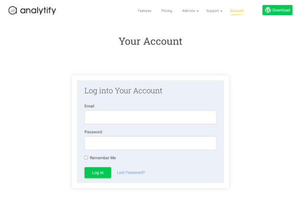
Have a look at the Analytify login page example. It has made use of the login form on a plain background.
It has the usual login page elements, including
- The email address field,
- Password field,
- Login Button
Analytify’s login page is of a simple design – you won’t find any background images or animations. It uses Download and Log In buttons in green that catch the users’ attention for these two call-to-action buttons.
It gets the job done and offers users validation should they need it. What else do we need from a login form?
3. Simple Social Buttons
Simple Social Button helps you take your Website/Blog to the next level by allowing your readers to share on any social media platform.
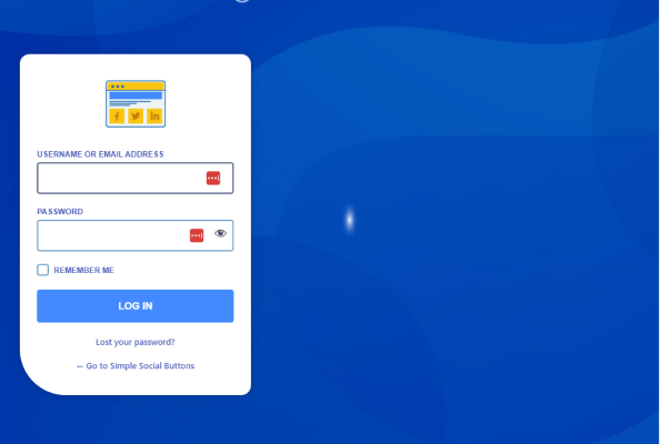
Simple Social Button has a very nice look and feels of the login page. Like Analytify, It has the usual login page elements, including:
- Username or Email address field
- Password field
- Login Button
Simple Social Button is one of our list’s most minimal login pages. You can see everything is intuitive and clear in the login form– the user is unlikely to be lost with what to do.
4. WPBrigade
WPBrigade is a WordPress Development agency specializing in outsourcing software development projects.
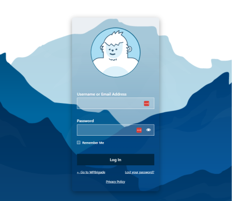
If we mainly talk about the login page of the WPBrigade, it is transparent; merges beautifully with the background.
WPBrigade showcases beautiful cool logo animation with a beautiful, relevant background.
Animation turns a simple action into a game – and you want to keep playing it. When you start wiring the Username or Email Address, the animation begins looking at it in amazement and peekaboo when writing the password. Cool, right?
5.SeedProd
SeedProd is one of the best WordPress page builder plugins that lets you create custom themes and template parts like Headers, Footers, Front Pages, and more for your website.
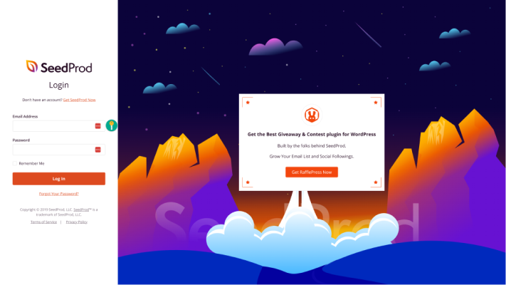
The SeedProd login page example has mainly 2 sections: a login form on the left side and an eye-catching image on the right. Awesome!
SeedProd offers a variety of options, such as:
- To help users log in.
- To help users sign up (if they don’t have an account).
6. WpForms
WPForms is a simple drag-and-drop page builder that lets you create a user-friendly login page.
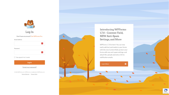
They have beautifully designed their login page. You can see the login form on the left side of the login page, and on the right side, they’ve used the call to action button, Learn More.
Clicking the Learn More button takes users to a new page where they can learn about Pricing, Testimonials, and Blogs in detail.
7. MonsterInsights
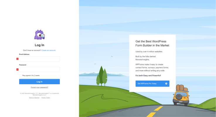
MonsterInsights has used related products and services for promotion on its login page.
- There are two sections of the MonsterIsights login page:
- First, you can see a login form on the left side of the login page.
- Secondly, you can see that MonsterInsights used the space to promote its sister product, WPForms.
This is an excellent way to attract users to any other WordPress plugin. You can adopt this design for a login page for promoting products from your partners or affiliates.
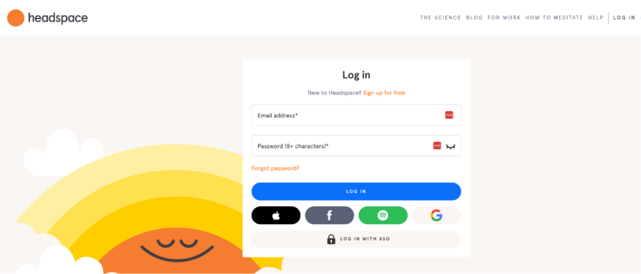
8. Headspace
Headspace has beautifully used muted colors and a minimalistic design that creates a peaceful impression. The overall look speaks entirely for the brand.
There are two options for the user:
- The user can log in using their email address and password.
- They can sign in with Apple, Facebook, Google, and Spotify.
Since Headspace adds its content to Spotify, it makes sense that they allow users to log in with that service.
9. Ted
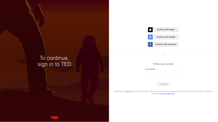
Who else has not heard of the TED talk? It’s a dedicated platform for researching and sharing knowledge through short talks and presentations. They do a lot more to educate global audiences in an accessible way.
Ted’s login page example has 2 halves, including:
- There is a headline inviting users to sign in to TED on the left side.
- There is a simple login form with different login methods on the right side. You can either use the traditional login method or the social login using your Apple, Google, and Facebook accounts.
10. Dribbble
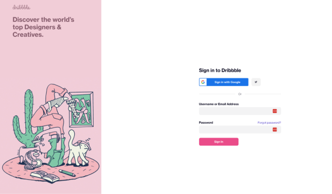
Dribble is an excellent platform for millions of designers and agencies worldwide to showcase their portfolios.
Dribbble’s login page example has a similar design with an illustration on the left and its form on the right.
Given that Dribbble is a community of designers and creatives, we love that they use their login page to promote work from their users, as it shows how much they value them.
11. Pocket
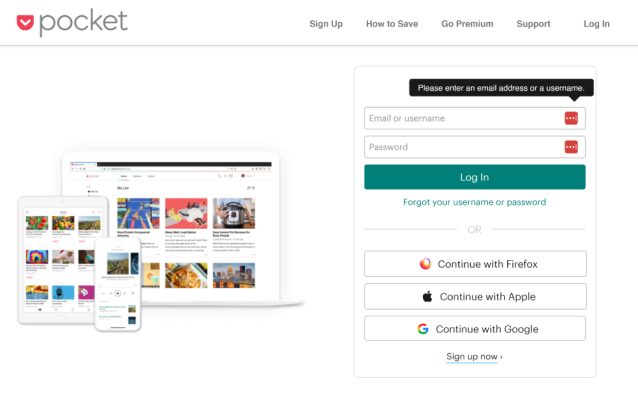
Pocket is a web and mobile app. It allows you to save content to read later offline. Pocket has a split-screen design with various options for logging in, including Firefox, Apple, and Google.
If you see on the left side of the login page, you cannot stop yourself from appraising how beautifully Pocket used the images to show how the app looks on different devices, including desktops, mobile phones, and tablets.
This is an excellent login page design. You can use the same design to showcase your products’ appearance on different devices.
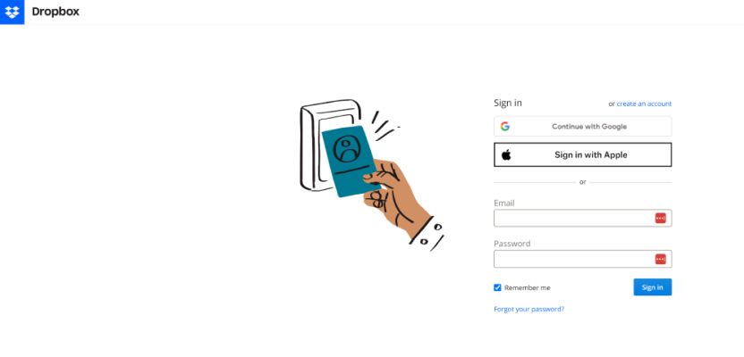
12. Dropbox
Dropbox is the best choice for storing and sharing essential files, cloud content, and web shortcuts.
Have a look at how Dropbox has presented its login page. It has the usual login page elements, including:
- Email address and password field
- Google sign in
- Apple sign in
- Custom graphics
- Option to create an account
13. BBC
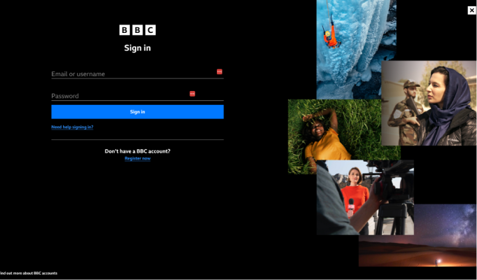
BBC is the world’s largest and oldest national broadcaster.
Look at the login page example for BBC. They have divided the login page into 2 halves:
- The left side of the login page has the login form.
- The right side of the login page displays different images telling different stories.
BBC regularly changes the login page image to coincide with different seasons and events.
Final Thoughts:
In this article, you’ve learned about the value of a login page for your WordPress and checked out some of the best login page examples. You read about how renowned agencies or plugins designed their login page.
There are numerous successful login page designs, and you might be wondering what could be best for you. So, the best tip for an excellent login page is to make it the way you want.
Let us know your preferred login page design in the comments section below.
That’s all! We hope you will now get the list of the best WordPress Login Page Design Examples. You may also want to check out How To Duplicate Page in WordPress and How to Display Custom WordPress Footer on Login Page.
Frequently Asked Questions
Why should I customize my WordPress Login Page?
WordPress has a dull default login page. It doesn’t reflect your site’s theme. To make it reflect your site’s theme, you’ll need to customize it.
Can I change the default WordPress login URL?
/wp-login.php is the default WordPress login URL. You can change this default URL to harden website security using a plugin. We’ll suggest you do this with LoginPress Hide Login Add-on.


