Email Notifications Best Practices and Examples (2025)
Are you looking for email notifications best practices for your site? If yes, we’ve got you covered.
Email notifications can affect businesses’ real-time ability to connect with audiences. Well-written taglines for your email notifications can boost engagement, drive conversions, and improve the customer experience.
Remember, it is necessary to know the best practices to ensure your messages stand out and deliver value.
Keeping this in mind, we’ve gathered the best practices and examples for creating effective email notifications.
Email Notifications Best Practices (TOC):
What are Email Notifications?
Email notifications are emails site owners send to their users to inform them about upcoming updates.
They help you inform your site users about important updates, activities, or changes.
It is usually triggered by user activity or any company event. Its primary goal is to inform, not promote.
You can use these email notifications for:
- Product recommendation
- Using it to alert customers about promotion
- Carrying out a referral scheme
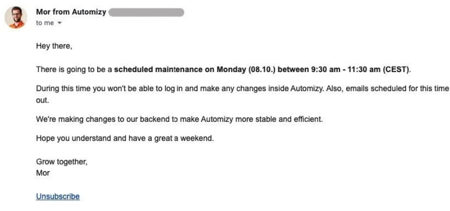
Here is an example of an email notification:
Why Send Email Notifications?
Email notifications are an essential aspect of communication. Here are several reasons why sending email notifications can be beneficial:
- User Engagement: Email notifications help maintain user engagement by informing users about a platform’s new features, updates, or activities.
- Boost Revenues: Notification emails can boost revenue by engaging customers.
- Timely Alerts: Email notifications can instantly alert users about important activities on platforms that offer real-time services, such as e-commerce or social networks.
- Increased Conversions: These notifications can include special offers, personalized recommendations, etc., which can persuade users to complete a purchase or take action. So you can use them to drive conversions.
- Re-engagement: You can use these notifications to re-engage users who haven’t visited your site for long.
Types of Email Notifications
Transactional Emails
These are automated emails triggered by a user’s action or a specific transaction on a WordPress site.
- Order Confirmation: Order confirmation email notifications are sent immediately after a purchase. They often include a summary of the shipping address and expected delivery time.
- Shipping Confirmation: When the order is shipped, the user receives this notification. It contains tracking information, shipping carrier details, and an estimated delivery date, confirming that the items are coming.
- Invoice Emails: Sent to provide a detailed receipt of the purchase. Includes a breakdown of the items, their costs, applicable taxes, and the total amount paid. It can also be sent periodically for subscription-based services.
Behavioral Emails
Behavioral email notifications are messages that result from specific user actions on your site.
- Alerts: These notifications notify users about actions they need to take, such as completing tasks, updating information, etc.
- Reminders: These notifications send prompts for upcoming deadlines, meetings, etc.
- Feedback: Informing users about their performance metrics, such as usage statistics.
These notifications aim to improve user experience by providing timely and relevant information based on their actions.
User Actions on a Website
Email notifications are the results of user actions on a WordPress site. They help keep users informed about their activities.
For example, you can send a confirmation email when the user fills out a registration form on your site.
Here are some other actions that can trigger email notifications:
- Newsletter Sign-Ups: There can be an email notification for successful subscriptions against newsletter signups.
- Account Creation: You can send email notifications after creating an account on a site.
- Password Resets: These notifications are sent to help a user reset their password.
Best Practices for Email Notifications
1. Add Engaging Subject Lines
Subject lines are the first thing recipients see. It plays a vital role in opening your email.
Remember, a proper subject line can improve open rates and set the tone for a successful email notification.
Here’s how to create compelling subject lines:
- Be Clear and Specific: It is better to ensure the subject line reflects the purpose of the email, i.e., Complete Your Purchase!
- Create Urgency: The best way to use a subject line with urgency. It can motivate recipients to take immediate action, like a Limited Time Offer.
- Personalize When Possible: You can also add the recipient’s name to make it more relevant. This increases the chances of an open, e.g., “John, Your Favorite Item Is Back in Stock!”
- Keep It Short: Always use a short subject line, i.e., under 50 characters.
In short, subject lines can capture attention and enhance the overall user experience.
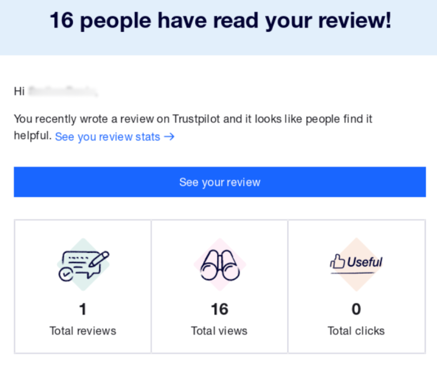
2. Personalize Your Content
Personalizing your content for email notifications is very important because it creates a more engaging and relevant communication experience for your audience.
For this purpose, you can add the recipient’s name, etc., in the starting paragraph. Plus, speaking directly to their needs and preferences.
This will capture the recipient’s attention, leading to higher open and click-through rates compared to generic messages.
For instance, Hi John, here’s your latest account update.
In addition, when email content aligns with the recipient’s interests, there is a higher chance that they will make a purchase.
Personalized content also helps reduce unsubscribed rates since they receive content that feels more useful.
3. Focus on a Single Idea
Focusing on a single idea in email notifications is a highly effective practice for clear communication.
Focusing on one main message will make the email more straightforward to understand and increase the chances of click-through rates. Pances that recipients will respond when they know exactly what the email asks them to do.
Let’s say you want to announce a sale:
Subject: Exclusive Offer: 25% Off Your Next Purchase!
Body: “For a limited time, enjoy 25% off your next order with the code SAVE25. Click the button below to start shopping!
CTA: Shop Now
No additional information: Avoid adding product highlights or other promotions that can minimize the main message.
4. Make Use of a Prominent CTA
You can add a well-designed CTA (Call to Action) to your email notifications to drive more user engagement, conversation, etc.
The CTA button encourages users to take action on your site. The key function of a CTA is to:
- Direct user attention
- Communicate the desired action
- Simplifies decision making
- Reduces friction
- Track user behavior
Using action-oriented language, making CTAs visually prominent, using actionable verbs like “Get Started,” using buttons instead of text links, and ensuring mobile responsiveness is better.
Here is an example of an effective CTA:

Here is one more example for you:
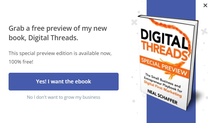
A well-placed CTA button tells users what to do next. Whether they want to view an order, track a shipment, or complete a purchase, the CTA acts as a guide, helping recipients take the desired action without any confusion.
5. Mobile-Responsiveness
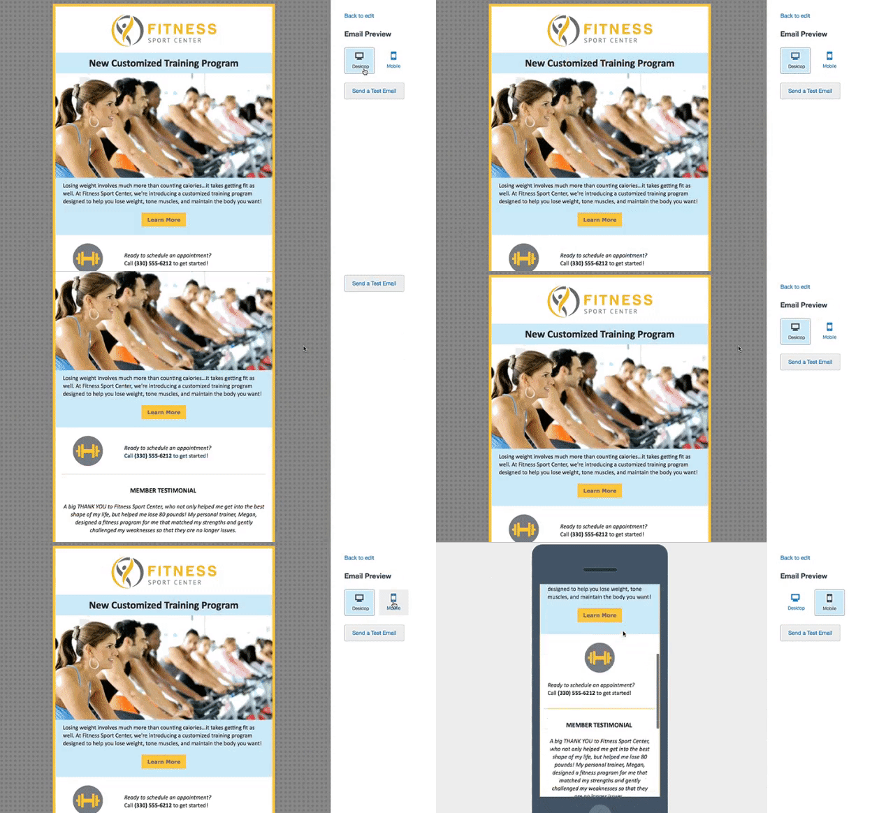
Since the world is mobile-driven, it’s better to ensure your email notifications are mobile-responsive. It’s not a choice; it’s a necessity.
A responsive email notification is well-suited for every screen size, such as a smartphone, tablet, or computer, making it easy for the recipient to read.
Here are some things you can do with responsive design:
- Use larger font sizes
- Line spacing
- Responsive headings
- Include padding
- Change colors/layout
- Scale graphics
See how mobile responsive email notifications look like:
6. Add Contact Information
It is also best practice to add contact information in email notifications, such as:
- Company name (for brand recognition)
- Email address ( for written inquiries)
- Phone number (for urgent matters)
- Social media links (for quick interactions)
- Physical address (if relevant for business purposes)
It provides an easy way for recipients to reach you, improves transparency, etc. In addition, it is better to place your contact details where it is visible, like the email footer or header.
Here is an example footer for email notifications:
Best regards,
[Your Company Name]
[Email Address]
[Phone Number]
Visit our website: [www.yourwebsite.com]
Follow us on [Facebook] | [Twitter] | [LinkedIn]
Need help? Contact us [here].
7. Maintain Brand Consistency
It is a good practice to maintain brand consistency in email notifications. You can achieve this by adding your company’s logo at the top of the email and your brand colors, logo, and typography.
It helps recipients recognize your emails as coming from your company, so your emails will never be mistaken for spam.
Over time, consistent email branding will convey your brand message. People will remember your brand more easily.
Best Email Notification Examples
Example #1
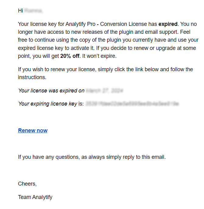
Subject line: Your Analytify Pro – Conversion License license has expired
Analytify is the best WordPress analytics plugin. Its email notifications are professional and clearly associated with the Analytify brand.
See the example below:
Example #2
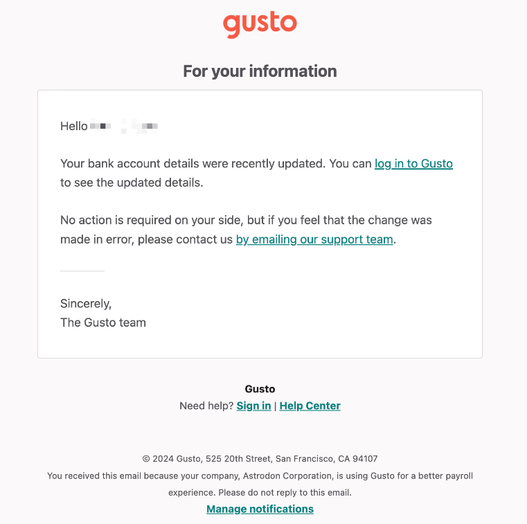
Subject line: Your bank account information has been changed
See how Gusto are presenting their ideas in the image below:
Example #3
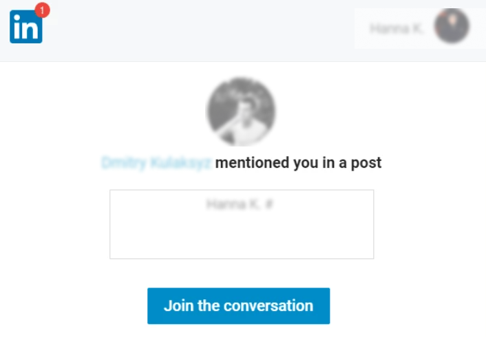
Subject line: Mr. Who mentioned you in the post
See, there is a clear and single call-to-action button. It does not confuse the recipient with extra information.
See the image below:
Track Email Campaigns with Analytify
Analytify is the best WordPress analytics plugin. It offers a powerful Email Notification Add-on that allows you to receive customized email reports about your site’s analytics straight to your inbox.
Analytify’s campaign tracking addon lets you utilize UTM parameters in the links within your emails. As a result, Google Analytics starts tracking recipients’ interaction with your site after clicking on those links. This way, you can quickly learn about the success of your campaigns and see how useful your marketing efforts were.
With this feature, you remain informed on important metrics, such as:
- Open rate: The percentage of recipients who open your email.
- Click-through Rate (CTR): The percentage of recipients who click a link in your email.
- Conversion Rate: The percentage of recipients who complete a desired action after clicking.
- Bounce Rate: The percentage of emails that could not be delivered.
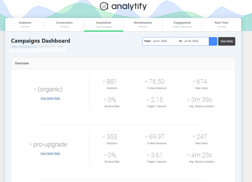
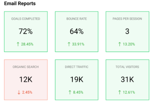
In addition, you can use the email notifications addon to customize your email reports so that they focus only on the most important metrics rather than providing unnecessary data, such as:
- Choose frequency for reports, i.e., daily, weekly, monthly, etc.
- Add specific metrics, e.g., site traffic, bounce rates, etc.
Bonus: Customize the Login Page with LoginPress
You might also want to use LoginPress to customize the overall look and feel of the default WordPress Login, Register, and Forget form.
This is the best WordPress login page customizer plugin. Use it to customize each element on the default WordPress login page, where you don’t need to code.

Secure Your WordPress Login
Stand out from the competition with the best WordPress login plugin that lets you strengthen your login page – no coding required!
Wait, there’s a lot more packed with LoginPress Pro including:
Upgrade to LoginPress Pro and strengthen the default WordPress login security.
Email Notifications Best Practices (FAQ)
What is an example of an email notification?
An email notification is a short email sent to tell users about any action they should take on your site. For example, users can receive an email notification when they update their passwords, activate accounts, etc. The key goal of such emails is to keep the user updated on what is happening inside your site instead of promoting anything.
How do you design an email notification?
Remember that your email notification has all the essential messaging elements, such as the relevant information (e.g., order details, updates), a clear call to action (CTA), personalization (e.g., customer name or preferences), contact information, and an unsubscribe option.
What is the optimal frequency for sending email notifications?
The optimal frequency depends on your audience. For promotional or informational updates, send no more than two emails per week.
What’s the best way to handle unsubscribe requests?
To handle unsubscribe requests, you should provide a clear and easy-to-find link in each email. In addition, it will be better to provide users with options to modify their email preferences, i.e., reducing email frequency. This will prevent users from unsubscribing.
Is it necessary to optimize email notifications for mobile devices?
You should optimize email notifications for mobile devices, as over half of all emails are opened on mobile devices.
Final Thoughts
In summary, we’ve outlined best practices and examples for email notifications.
Following these best practices can engage your audience, drive action, and strengthen your brand.
That’s all for this article!
Here are the key takeaways:
- Add Engaging Subject Lines
- Personalize Your Content
- Focus on a Single Idea
- Make Use of a Prominent CTA
- Mobile-Responsiveness
- Add Contact Information
- Maintain Brand Consistency
You may also want to check out our guides on:
- How to Add Social Media Icons to WordPress
- How to Add a Login Button to Your WordPress Menu
- How to Hide Page Title in WordPress
Thank you for reading this article. Don’t forget to share this article with others who might find this helpful, too!
