Is Your WordPress Login Page Accessible? (A WCAG Checklist)

The default WordPress login page is reasonably accessible, but customizing it with a plugin or custom CSS can break WCAG compliance in four places: contrast, labels, button text and keyboard focus. You can check all four against your own login page in about ten minutes with a contrast checker, your keyboard and a screen reader.
In this post, you will find the checklist, step by step.
This article covers whether the default WordPress login page is compliant out of the box, the four things customization usually breaks, a step-by-step test for keyboard and screen reader access, and a plain answer on ADA lawsuit risk. My team built LoginPress, and this post shows exactly which of its settings to double-check once you’re done reading.
WordPress Login Page Accessible (TOC):
Is a Custom WordPress Login Page WCAG Compliant by Default?
The default, unstyled WordPress login page is reasonably accessible out of the box, but the moment you customize it with a plugin or custom CSS, that compliance is no longer guaranteed. Whether your WordPress login page is accessible after that point depends entirely on the choices you make next. In short, WordPress login WCAG compliance is never automatic once you start customizing.
WCAG compliance comes down to four principles: content has to be perceivable, operable, understandable, and strong. WordPress core generally clears that bar on its login screen. It’s the layer you add on top, a background image, a restyled button, a new color palette, that most often breaks one of those four principles. So the real question isn’t “is WordPress accessible.” It’s “did my changes stay accessible?”
What Breaks Accessibility on a Customized WordPress Login Page?
Customizing a WordPress login page most often breaks accessibility in four places: low-contrast backgrounds, unlabeled custom buttons, missing field labels, and a broken keyboard focus order. Fixing all four is what turns a good-looking form into a genuinely accessible login form WordPress users can rely on regardless of ability.
None of these four issues needs an accessibility specialist to catch. A free contrast checker and ten minutes with your keyboard cover most of it.
These four issues share one root cause. Most of us design a login page by eye, checking how it looks, not how it behaves for a keyboard-only visitor or a screen reader user. A page can look perfectly on-brand and still fail every one of these checks, because visual polish and accessible structure are two separate jobs.
- Low-contrast backgrounds. A busy image or a light color behind light text drops the readable contrast below the WCAG minimum.
- Icon-only buttons. A login button restyled down to a bare icon with no visible text often loses its accessible name.
- Missing or mismatched field labels. A custom CSS pass can visually hide a label without removing it from the code, or worse, delete it entirely.
- Broken tab order. Custom CSS that strips the default focus outline is the single most common way login pages fail a keyboard test.
Low Color Contrast on Custom Backgrounds
A background image or color choice fails WCAG when it drops the effective contrast of your form text or buttons below the 4.5:1 minimum ratio WCAG sets for normal text.
Picture a photography site with a busy background image sitting behind a plain white login form. The form text becomes hard to read at a glance, and a low-vision visitor may not be able to read it at all. Run your contrast checker against the actual rendered page, not the raw background color file, because transparency and overlays change what the eye actually sees.
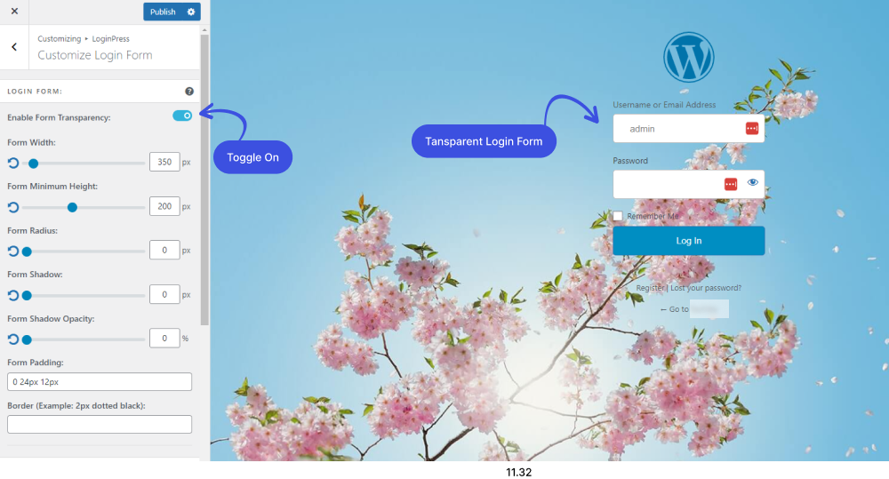
LoginPress’s Form Transparency and Background Color settings are neutral tools on their own. They only cause a problem if the combination you choose fails the ratio, so the fix is to re-test after every change, not to avoid the feature.
Unlabeled or Icon-Only Buttons
An icon-only login button breaks accessibility when it has no visible text and no accessible name a screen reader can announce. Adding that label back in is a small change that keeps your WordPress login page accessible for assistive technology users.
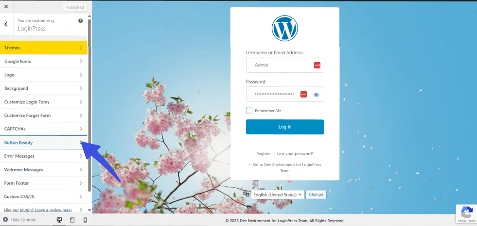
A common example: a login button restyled as a plain arrow icon, with nothing behind it for assistive technology to read aloud. LoginPress’s Beauty Button setting changes how the button looks, not the underlying accessible name, so this is a design choice to check, not a plugin defect. Keep visible button text if you can. If the design calls for an icon only, add an accessible label behind it.
How Do You Make a WordPress Login Form Screen-Reader Friendly?
You make a WordPress login form screen-reader friendly by keeping each field’s label tied directly to its input and making sure error messages get announced out loud. Running this screen reader WordPress login check takes under a minute, and it turns the page into a purely audio experience, so the step matters as much as any visual polish.
Use this test on every client site before it goes live:
- Turn on a screen reader. VoiceOver is built into every Mac and is the fastest way to test. NVDA works well on Windows.
- Tab to the username field and confirm the screen reader announces its label, something like “Username, edit text.”
- Tab to the password field and confirm the same.
- Tab to the submit button and confirm it announces as a button with a clear name, not just “button.”
- Enter a wrong password on purpose and confirm the error message gets read aloud, not just displayed on screen.
LoginPress’s Input Field Label Color setting and its custom error message option are the two controls most relevant here. Changing a label’s color doesn’t touch whether it’s programmatically tied to its input, so this test is still worth running after every visual change.
How Do You Test Keyboard Navigation on a Login Page?
You test keyboard navigation on a login page by unplugging your mouse and tabbing through the entire form in order, from username to submit. This kind of keyboard navigation login page WordPress test takes about two minutes and needs no special tools.
- Tab to the username field.
- Tab to the password field.
- Tab to the Remember Me checkbox.
- Tab to the submit button.
- Confirm you can see a visible focus outline at every single stop.
If step five fails anywhere, check your custom CSS. Removing the default focus outline for a cleaner look is the most frequent keyboard failure I see on customized login pages, and it’s rarely intentional. It usually happens when a theme’s global CSS or a copy-pasted snippet resets outline: none without adding a replacement style back in.
Does a Custom Login Page Create ADA Lawsuit Risk?
A custom login page can factor into ADA risk if it’s part of a site the public uses to log in, such as a membership site or a WooCommerce customer account area, but it’s a far less common lawsuit target than a public storefront page. Keeping an ADA-compliant WordPress login page simply means applying the same WCAG basics you’d use anywhere else on your site.
ADA web claims generally focus on whether a page counts as a “place of public accommodation,” which in practice means content the public relies on to use your business. An admin-only login screen that only staff ever see carries low exposure. A membership login or a customer account login carries roughly the same exposure as any other page a paying customer has to use. Plaintiffs filed 3,948 ADA website accessibility lawsuits in 2025, up nearly 24% from 2024, and login or account pages show up as a named issue in a meaningful share of those filings, not usually the main one, but often enough to flag.
The practical takeaway is this: if your login page sits behind a membership site, a course platform, or a WooCommerce customer account, treat it with the same care you’d give your checkout page. If it’s purely an internal staff login, the same urgency doesn’t apply, though fixing the four issues above still costs you almost nothing and helps everyone using the page.
One note before you move on: this is general information, not legal advice. Talk to a lawyer if you have a specific compliance question tied to your business.
Where LoginPress Fits in Your Accessibility Checklist
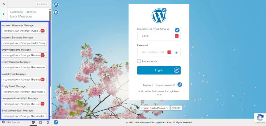
LoginPress gives you the exact controls this checklist points to: background, logo, form colors, button styling, and field labels, so you can fix an issue the moment you spot one. These are exactly the settings that keep a WordPress login page accessible after you customize it.
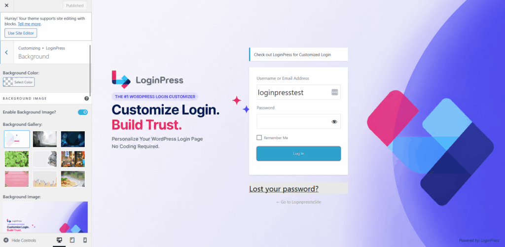
We didn’t build LoginPress to run accessibility audits. That’s not what it does, and I want to be upfront about that. What LoginPress does is put every one of the settings this article flags in one place, so once you know what to check, you know exactly where to go: LoginPress >> Customizer >> Background, Login Form, or Beauty Button. If you’re starting from scratch, our guide on how to customize your first login form with LoginPress walks through where each of these settings lives. That’s the whole value here. Fast fixes, not automated scanning.
If locking down who can even reach your login page matters to you as much as how it reads to a screen reader, our guide on hiding the WordPress login URL covers that aspect separately.
WCAG Checklist to Make Your WordPress Login Page Accessible
Run this checklist against your live login page to confirm your WordPress login page is accessible before you publish. Most site owners finish it in under ten minutes.
| # | Check | Pass Criteria |
|---|---|---|
| 1 | Background and text contrast | Meets a 4.5:1 ratio against form text |
| 2 | Button contrast | Meets a 4.5:1 ratio against its background |
| 3 | Focus outline | Visible on every field and the submit button |
| 4 | Tab order | Matches the visual order: username, password, remember me, submit |
| 5 | Field labels | Announce correctly through a screen reader |
| 6 | Error messages | Get announced by a screen reader, not just shown on screen |
| 7 | Logo alt text | Describes the image or its link purpose |
| 8 | Icon-only buttons | Have an accessible name behind the icon |
| 9 | 200% browser zoom | Form stays usable with no cut-off fields |
Frequently Asked Questions
Is a custom WordPress login page WCAG compliant by default?
Not automatically. The stock WordPress login page is reasonably accessible out of the box, but any customization- a background image, a restyled button, custom field colors- can break that compliance if you don’t check it afterward. Compliance depends on the specific changes you make, not on WordPress core. In other words, keeping a WordPress login page accessible comes down to your customizations, not the software itself.
What breaks accessibility on a customized WordPress login page?
The most common breakages are low-contrast backgrounds, icon-only buttons with no accessible label, missing or mismatched field labels, and a broken keyboard focus order caused by custom CSS that removes the default focus outline. All four are checkable in a few minutes with free tools.
How do I make my WordPress login form screen-reader friendly?
Turn on a screen reader and tab through the form. Each field should announce its label, such as “Username, edit text,” and a failed login attempt should announce the error message clearly. If a field stays silent or gets mislabeled, check that its label is still tied to the input after your customization.
Why is my login page not announcing field labels to a screen reader?
This usually happens when a custom CSS pass visually hides the default <label> tag instead of just restyling it, which disconnects the label from its input for assistive technology. Check your CSS for display: none or visibility: hidden on label elements and swap it for a visually-hidden class that keeps the label in the accessibility tree instead.
Does adding a custom login page create ADA lawsuit risk?
It can, but mainly if the page is part of a site the public uses to log in, like a membership site or a customer account area. Admin-only logins are rarely lawsuit targets. This is general information, not legal advice, so talk to a lawyer if you have a specific compliance concern.
Do I need to add alt text to a custom login page logo?
Yes. A custom logo image needs descriptive alt text just like any other image, so a screen reader can announce what it is instead of skipping it or reading a filename. If the logo also links to your homepage, the alt text should reflect that link’s purpose, something like “Return to homepage” rather than just the company name.
Final Thoughts
A custom WordPress login page isn’t automatically inaccessible, but keeping a WordPress login page accessible takes more than good intentions. The branding choices most of us make without thinking twice- background contrast, icon-only buttons, broken keyboard focus- quietly break it more often than not. Ten minutes with the checklist above catches most of it before a customer or a lawyer does.
If you also want to see how visitors actually use your site once they’re past the login screen, Analytify shows that data right inside your WordPress dashboard.
Here’s what I’d do next, in order:
- Run a contrast check on your current login form background and button with a free tool.
- Unplug your mouse and tab through your login page to confirm you can access and use every field.
- Turn on a screen reader and confirm each field announces its label correctly.
Check LoginPress’s features and pricing.
Further Readings: