One Page Website Examples: Best Single-Page Designs

A one-page website packs every section- hero, about, services, and contact- into a single scrolling layout. No multi-page navigation. No drop-off between clicks. That focused structure is why one-page sites convert better than cluttered multi-page builds.
But most one-page websites forget one thing: what happens after the visitor clicks sign up.
In this post, you’ll find 11 real one page website examples, what makes each one work, and the one design touchpoint that completes the brand experience for any WordPress site: the login page.
And if you think that kind of design is exactly what your own site needs, follow along to create a highly converting one-page website.
One Page Scroll Websites (TOC):
What Is a One-Page Website and Why Does It Work?
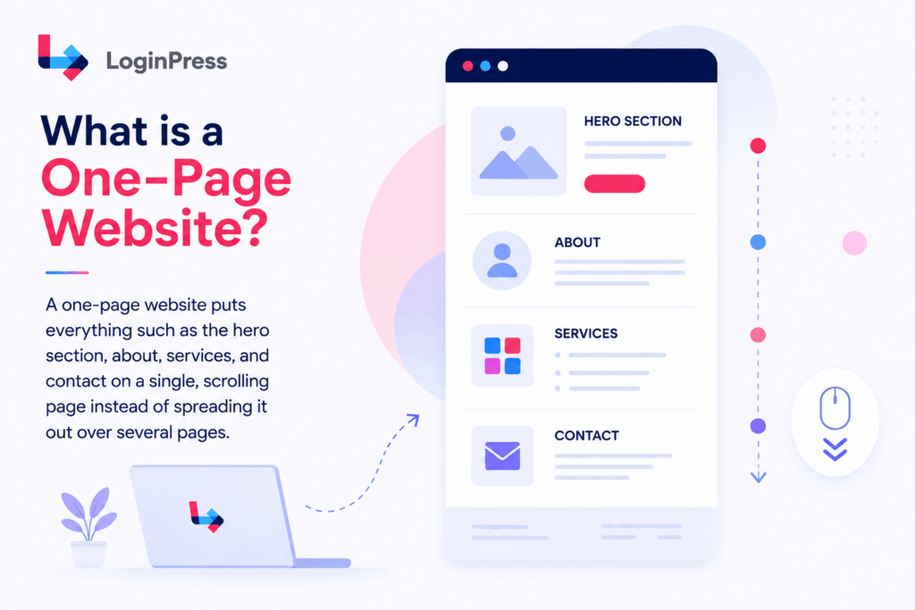
A one-page website puts everything, such as the hero section, about, services, and contact, on a single, scrolling page instead of spreading it out over several pages.
Visitors to this kind of website navigate between sections using anchor links or smooth scrolling. There are no page reloads and no complicated navigation menus.
At the end of 2025, there were over 1.38 billion websites in existence according to the statistics by Netcraft.
When Is a One-Page Site the Right Choice?
One-page sites can be more effective than traditional multi-page websites in certain situations:
- Personal brands centered around an individual
- Service businesses with a single core offer
- Product launches and pre-launch landing pages
- Event sites with a fixed date and program
- Personal brands are built around one person
- Local businesses with walk-in or call-based conversion
Design quality matters immediately. According to neuroscience research stated by Canva in 2025, it is confirmed that high-quality visuals are encoded in the human brain 74% faster than text.
A one-page site stands out because the designer controls the entire scroll experience, so there are no extra pages to distract from the main story.
Single-page websites work well in many industries because they make things simple and easy to browse. There is just one path, one decision, and one place to take action.
So, what makes a one-page site effective rather than forgettable? The 11 examples below show what works.
What Are the Best One-Page Website Examples?
The best one-page website examples in 2026 combine a clear hero section, focused messaging, smooth anchor navigation, and a single primary call to action that guides visitors without distraction.
All the one page scroll website examples below include one specific lesson you can apply to your own WordPress site.
Creative Course Website
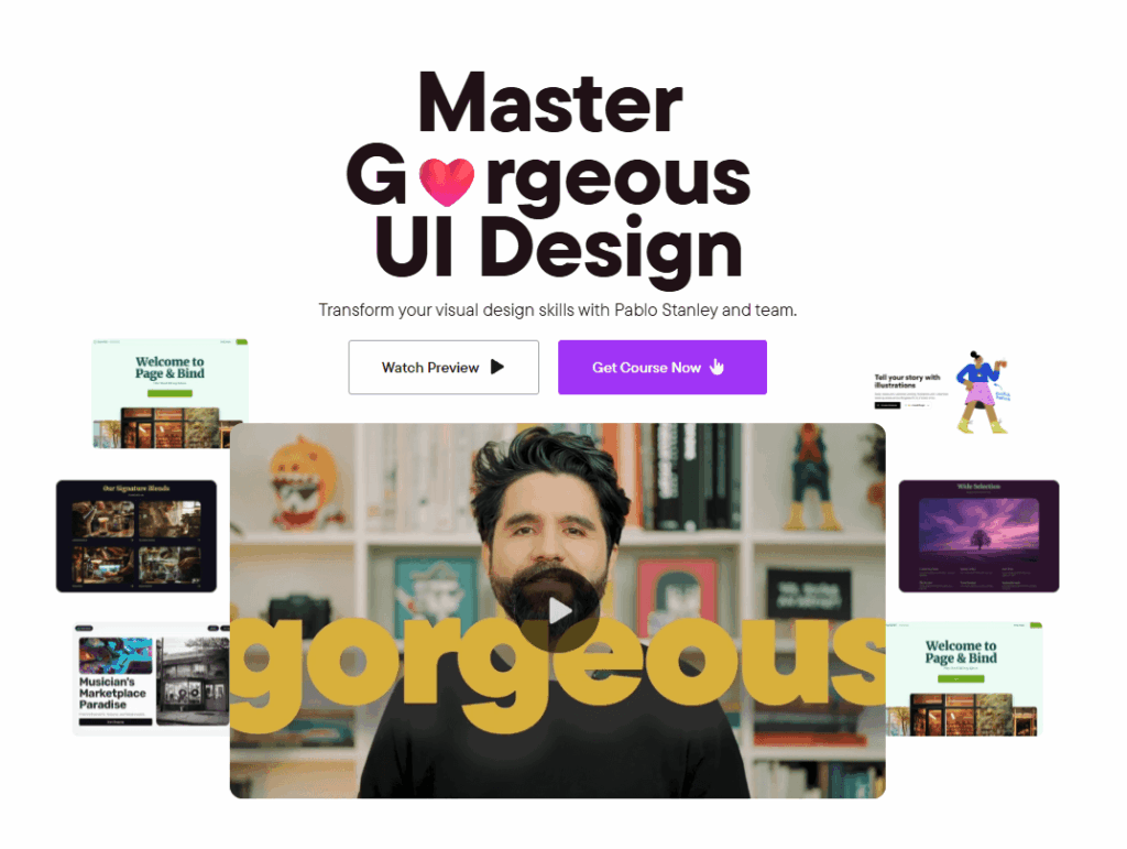
The Master Gorgeous UI Design course page stands out for its clear visual hierarchy. Pablo Stanley shows off his skills with playful emojis, lots of whitespace, and animations that appear when you hover. He uses a direct and knowledgeable tone to guide readers through the content.
Next to the main call to action, clear content blocks explain what students will learn. Testimonials from industry professionals nearby help build credibility.
This course site structures a single scroll as a sequential case study: brief, process, result, contact. The designer never asks the visitor to navigate. They just follow the story down.
The lesson: replace your “work” page with a single scroll that walks visitors through one flagship project from start to finish.
According to Hostinger, 90% of all websites, corresponding to 1.2 billion worldwide, have implemented responsive design.
Creative Portfolio Website
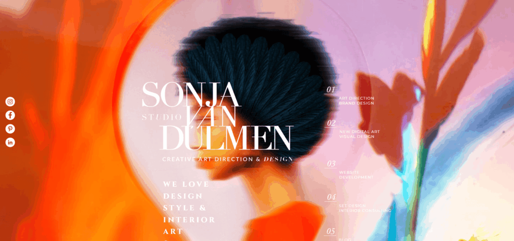
Sonja van Duelmen’s portfolio stands out with a bold, magazine-style layout that grabs attention on the spot. The site features a full-screen hero image and a strong logo, making a memorable first impression.
A grid-based navigation menu in the center helps visitors easily find the art direction and brand design sections.
Since everything stays on one URL, users get an organized and immersive way to explore her artistic work.
The lesson: Build your navigation menu directly into the central grid layout. This removes the need for top header menus. It forces visitors to engage with your visual work immediately upon arrival.
Technical Portfolio Website
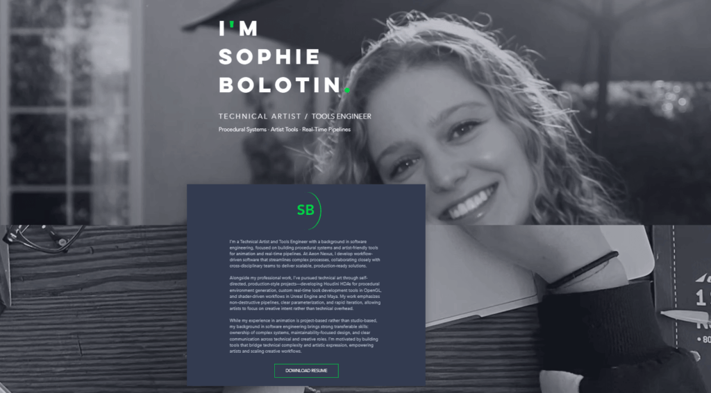
Sophie Bolotin builds a strong developer identity with a high-contrast, one-page design. Instead of using generic bio text, she shows both her technical skills and creative side right at the top.
The dark theme and monospace font quickly show recruiters her technical background. This setup makes it easy to see both her code projects and design work immediately.
The Lesson: Use a dark, high-contrast theme to show your technical skills instantly. This approach helps keep recruiters interested and means you don’t need to link to an outside resume.
Corporate Website
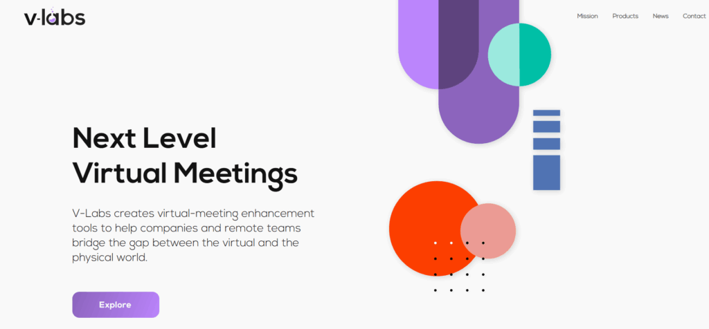
V-Labs removes unnecessary corporate tech clutter by showing complex virtualization tools all on one scroll. The interface uses a simple layout and lots of white space to keep the focus on product feature metrics.
Rather than sending users through long software documentation, clear product cards show feature capabilities right on the spot.
An easy-to-use email capture box sits in the footer, collecting leads without distracting from the product.
The Lesson: Show your main product data metrics on the main page. Avoid hiding technical feature details in deep submenus. Being transparent like this helps reduce conversion drop-offs, especially for busy enterprise buyers.
Marketing Website
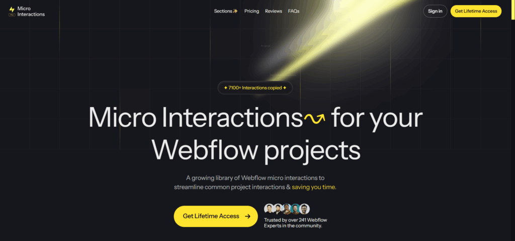
The MicroInteractions site transforms a digital asset marketplace into a hyper-focused, single-scroll utility. The layout uses a high-contrast black and yellow palette to draw immediate visual focus to the primary lifetime access buttons.
Instead of explaining animation theory, the canvas hosts live, interactive product previews paired with instant download paths.
Scroll-triggered lists and an integrated testimonial wall create a rhythmic user experience that leads directly into a clear, fixed-price grid.
The lesson: validate your digital product value through immediate interactive utility before showing the price. Let users test features right on the page canvas. This hands-on interaction eliminates friction and drives rapid conversion down at the checkout section.
Small Business Website
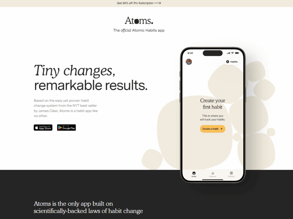
The Atoms landing page helps book readers become mobile app users by creating a sense of visual familiarity. The interface uses a warm, cream-colored palette that matches the well-known Atomic Habits book cover.
This approach builds on the trust readers already have, while keeping things simple and not overloading them with technical details.
A smartphone mockup stays on the page, showing a gold call-to-action button that highlights the main habit-creation feature. This design keeps the focus on getting users to download the app from the App Store or Google Play.
The Lesson: Make sure your digital product landing page matches your offline brand materials. Keeping visuals consistent across different platforms helps users trust your product. It also makes onboarding easier and encourages more people to download your app.
SaaS Product Website
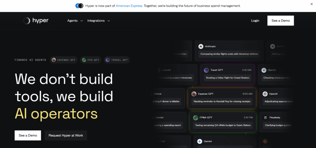
Hyper uses a dark, immersive design to turn a complex software pitch into an interactive demo. Instead of starting with an introduction, the site opens with a live mockup that shows speed and cost metrics.
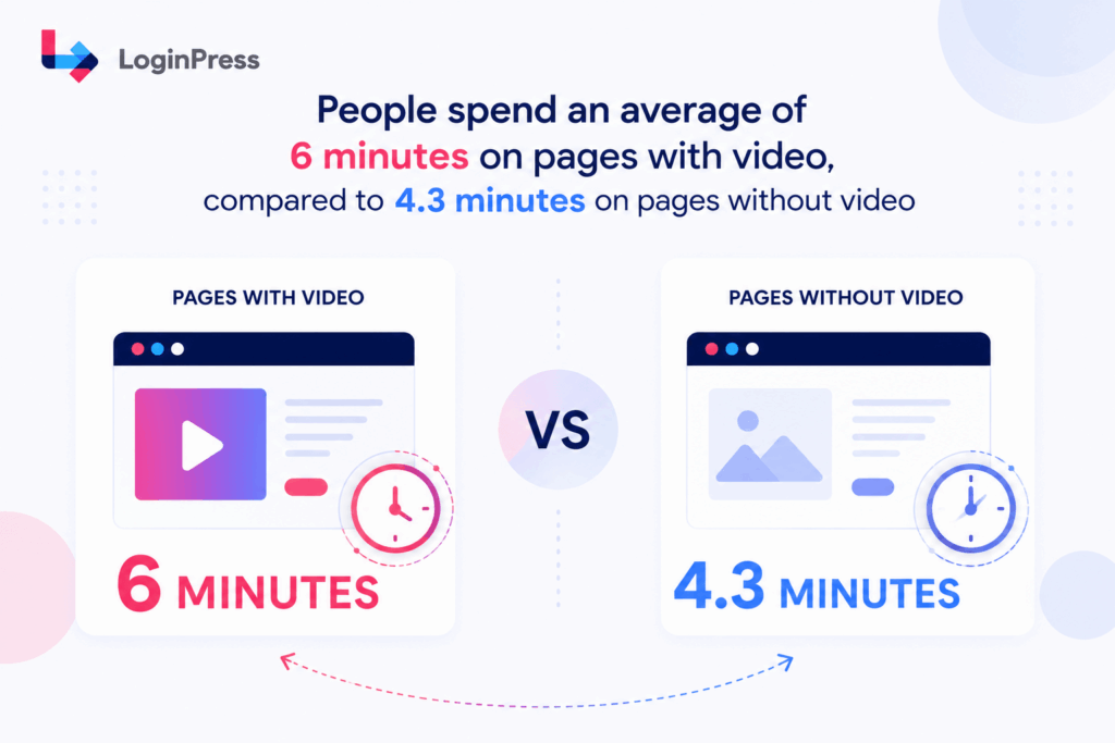
People spend an average of 6 minutes on pages with video, compared to 4.3 minutes on pages without video, according to statistics by Wistia.
A sticky navigation bar stays visible at the bottom of the screen, so the main conversion buttons are always easy to find as users scroll past the space-themed graphics.
This setup lets enterprise buyers quickly schedule a demo without having to scroll back up.
The Lesson: keep your main call-to-action buttons in a sticky menu. This approach makes it easier for users to act on single-scroll pages. Motivated leads can convert as soon as they finish reading about your product.
WordPress Plugin Website
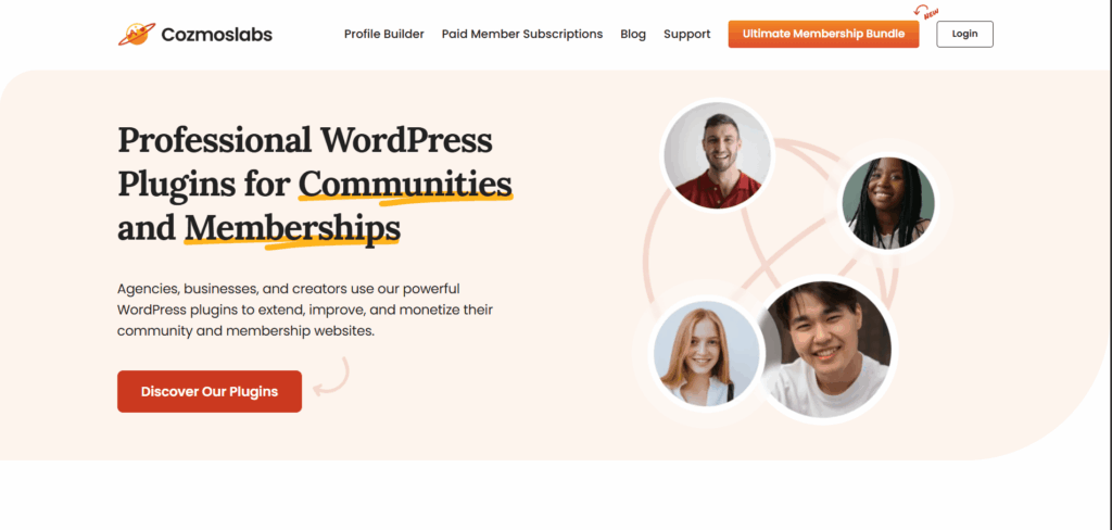
Cozmoslabs quickly builds trust by showing clear, relatable images and a focused headline. The landing page highlights important value phrases with custom underlines, making it easy for visitors to spot the main offer.
Rather than crowding the page with technical details, a bold primary button leads users straight to the product catalog.
The simple top header includes a clear login button in the corner, so registered users can easily reach their account dashboards.
The Lesson: Put a clear login button in your main navigation menu. Single-page layouts are great for attracting new visitors, but they should also make it easy for returning users to find their account portals.
Developers Tool Website
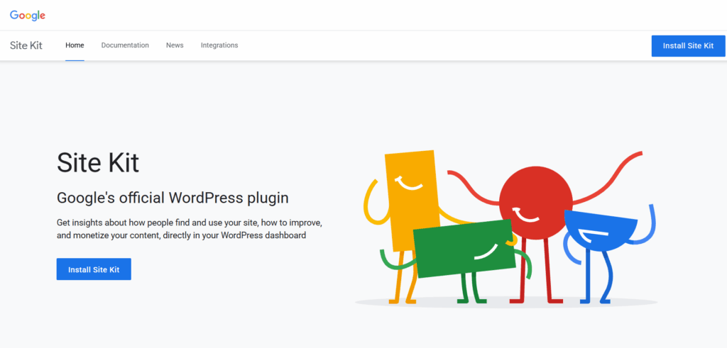
Google’s SiteKit landing page uses a clean, minimalist design. The layout draws attention to the company’s signature colors and playful geometric illustrations.
A straightforward headline quickly explains what the product is and what it does.
The main action button stands below the description, and the same button appears in the sticky top header. This way, users can always see the install option as they scroll.
The Lesson: Place your main action button both in the header and in the main section. This approach helps you reach users who want to act instantly and those who prefer to scroll before deciding.
Event Launch Website
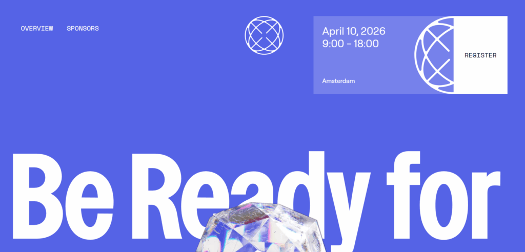
AcidEvents site boosts sign-ups by making key event details a main part of the design. The page uses large bold text set behind a geometric crystal shape to add instant visual interest.
Rather than hiding the event at the bottom, a clear info card in the top right shows the date, time, and location.
The registration button sits right next to this info card. This setup helps people register as soon as they see the event fits their schedule.
The Lesson: keep your event details close to your main registration button. Showing the date, location, and sign-up option together makes it easier for people to decide quickly, especially for busy buyers.
Tech Workshop Website
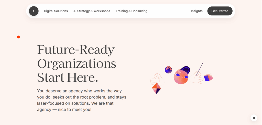
MostlySerious consulting layout uses a floating capsule header to highlight its main conversion path. The design pairs an elegant serif headline with abstract vector illustrations.
A concise paragraph introduces the agency and sets a friendly tone. The white capsule navigation bar sits above the layout and includes a clear action button on the far right.
This approach makes the consulting introduction feel approachable and keeps the next step easy to find, even as users scroll down.
The Lesson: Use a floating pill-shaped header to organize your navigation menu. Placing the main action link in a high-contrast container draws the user’s attention. This setup keeps the action button easy to reach without making your background artwork look crowded.
Every example above carefully controls one thing: the visual and emotional experience from the first scroll to the final CTA.
That same standard should apply to every touchpoint your visitor encounters, including the WordPress login page they land on after they sign up.
We often see WordPress users copy visual elements from inspiration galleries but forget to carry those same design choices into member areas. Even small inconsistencies like a default login screen after a polished landing page can reduce perceived trust
The next section breaks down the design elements these single web page examples share and shows exactly how LoginPress lets you carry that same brand quality into your login screen.
What Design Elements Do the Best One Page Websites Share?
The most effective one-page websites all have eight key design features.
These include a strong hero section that quickly answers the visitor’s main question, anchor navigation for easy access to sections, a consistent color palette, well-placed whitespace, social proof near the top, one main call to action repeated throughout, a mobile-first layout, and fast loading times.
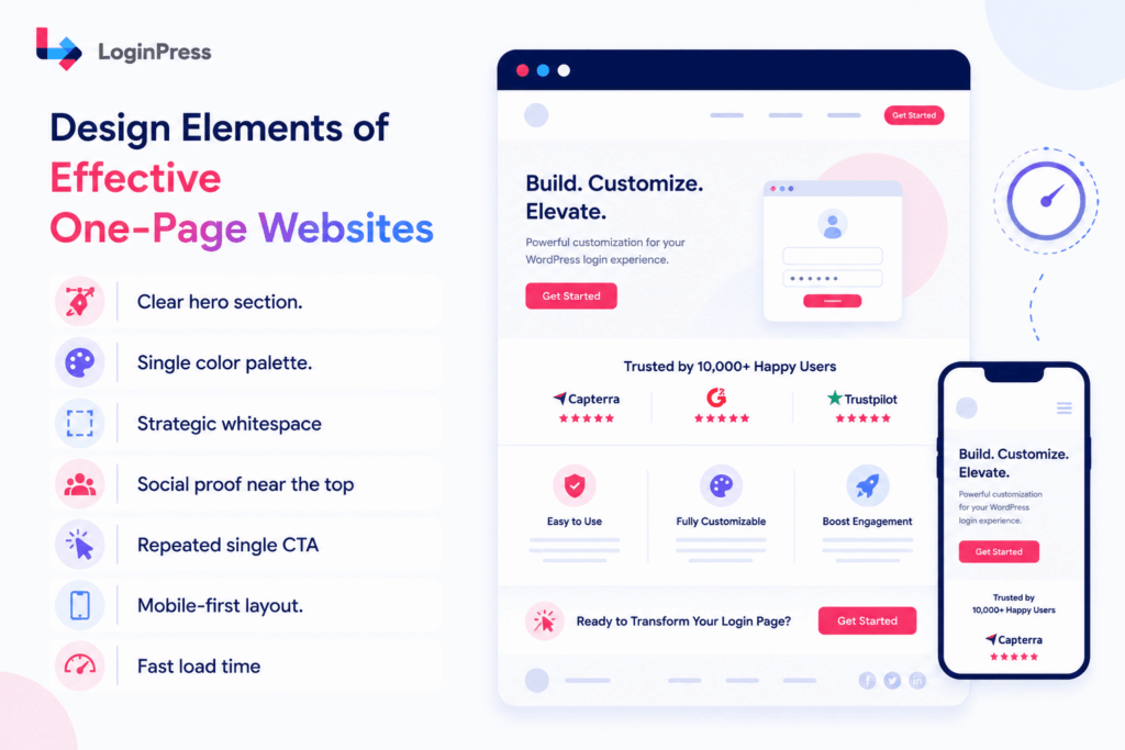
Each example from earlier uses at least six of these eight features. Here’s what each discussed in detail:
- Clear hero section. It should answer “what is this and why should I care” in less than three seconds. All you need is a headline, a subheadline, and one main call to action.
- Anchor navigation. Sticky menus or smooth-scroll links help users move to any section without getting lost. This is especially important for pages longer than 800 pixels.
- Single color palette. Two to three colors maximum. One primary, one accent for CTAs, one neutral for backgrounds and text. Every section uses the same set
- Strategic whitespace. The generous whitespace slows the visitor’s reading pace, making each section feel more intentional. That naturally increases attention on the CTA without adding visual noise.
- Social proof is near the top. Showing testimonials, logos, or key numbers in the first two sections helps build trust before visitors scroll down.
- Repeated single CTA. The same action appears at the end of each section. Different actions competing on a single page split attention and reduce conversion rates.
- Mobile-first layout. Since more than 60% of visitors use mobile devices, a single-column scroll design works better than a multi-page navigation system.
- Fast load time. Each second of delay can lower your conversion rate. Use compressed images, as few scripts as possible, and clean code to keep your site fast.
Most designers use all eight of these elements on their main pages. However, there is one page that often gets overlooked.
What Different Industries Can Learn?
| Industry | Best Example | Biggest Lesson |
| SaaS | Hyper | Sticky CTA |
| Portfolio | Sonja | Visual hierarchy |
| Event | AcidEvents | CTA beside date |
| Product | Site Kit | Repeated CTA |
| Local Business | V-Labs | Clear metrics |
How Do You Match Your WordPress Login Page to Your One-Page Design?
Your WordPress login page is the first thing a member or returning visitor sees after they sign up or log out.

Important: Users’ first impressions of businesses are 94% influenced by design.
On a one-page site with a strong visual brand, the default login screen breaks the design continuity you worked hard to build.
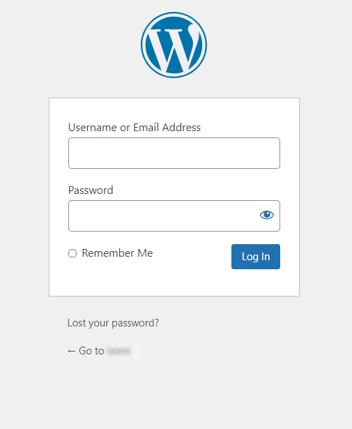
The default screen is white. The logo is WordPress, not yours. The button is standard blue. A visitor who just converted on a polished, branded page suddenly lands on a form that looks like a completely different website.
LoginPress fixes this. It lets you customize your WordPress login page to match your site’s colors, fonts, logo, and background. No page builder. No code. Just a visual settings panel inside your WordPress admin.
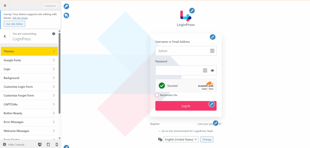
Here’s how you can make your login page match your one-page site’s brand:
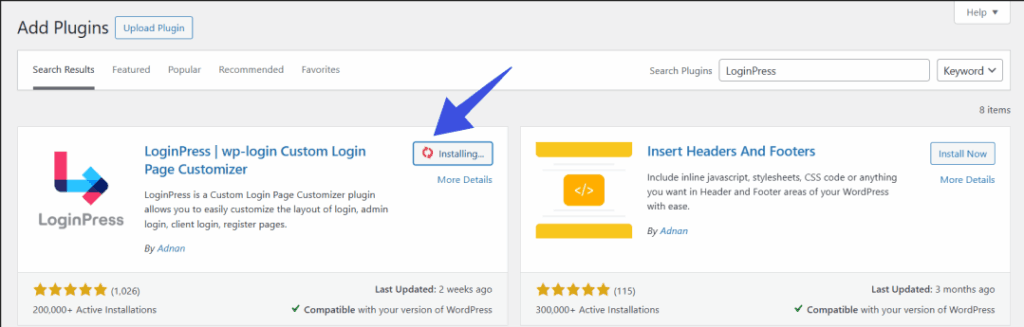
- Install and activate LoginPress: In your WordPress admin, go to Plugins, click Add New, search for LoginPress, then install and activate it.
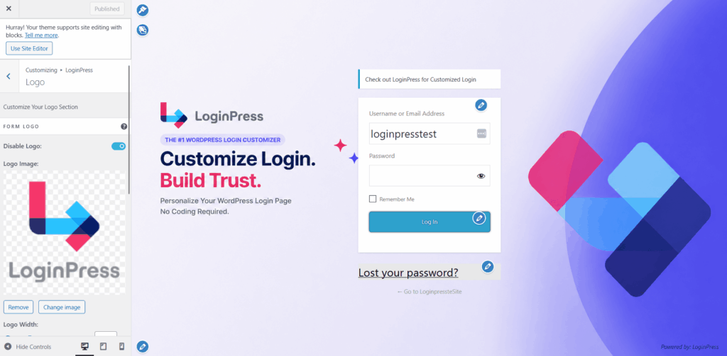
- Replace the logo: Open the LoginPress customization panel. Upload your site logo to swap out the default WordPress logo. Use the same logo you have in your site’s navigation or hero section.
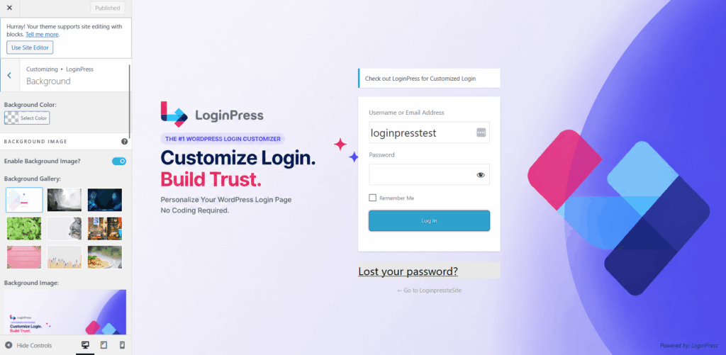
- Set the background: Pick a solid color from your brand palette or upload a branded background image. If your site starts with a dark hero section, use a similar dark background for your login page to keep things consistent.
- Customize Form and Button: Change the input field borders, button color, and button text color to match your site’s main and accent colors. Try to make your login button look just like your main call-to-action button.
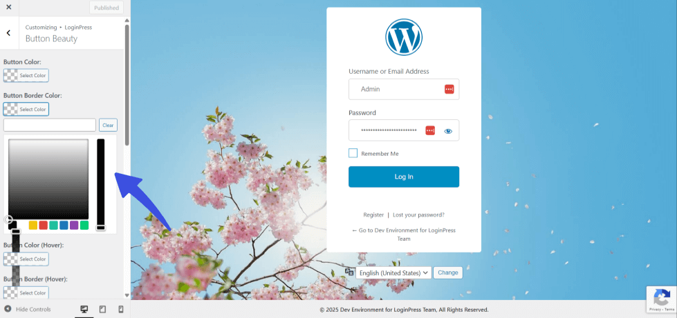
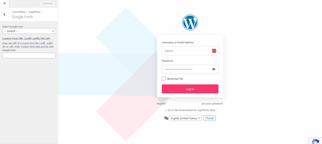
- Set the typography: Choose the same font family your one-page site uses. Keeping your fonts consistent is a clear sign of a professional and thoughtful brand.
- Preview your changes: Using the LoginPress live preview to make sure your login page feels like part of your one-page site. Tweak the design until everything fits together.
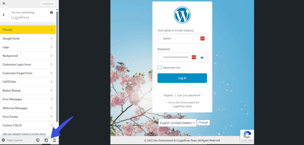
A branded login page does three things. It reduces friction for returning members. It reinforces your visual identity at a moment of high intent. And it completes the brand experience your one-page site started.
Note: Do you want tighter security alongside a branded login page? LoginPress Pro adds Captcha, limiting login attempts, and role-based smart redirect controls to protect the same form you just branded.
Frequently Asked Questions
What is an example of a one page website?
A one-page website presents all its content on a single continuously scrolling page rather than across multiple linked pages. Common examples include portfolio sites for photographers or designers, landing pages for SaaS product launches, local service business sites for restaurants or salons, and event registration pages. These sites work best when the goal is clear; the audience is specific, and all the information a visitor needs can be organized into a logical scroll.
What makes a good one page website design?
A good one-page website design answers the visitor’s key question within 3 seconds of landing, uses anchor links to navigate between sections, repeats a single, consistent call to action rather than competing CTAs, and loads quickly on mobile. The best designs use a two-to-three color palette applied consistently across every section, include social proof near the top of the page, and guide the visitor through a logical narrative from problem to solution to action. Whitespace between sections is as important as the content itself.
What are the best one-page websites for inspiration?
The best one-page websites for inspiration in 2026 include creative portfolio sites that use bold typography and full-screen imagery to make an immediate impression, SaaS product landing pages with scroll-triggered animations that reveal features progressively, local business sites that lead with trust signals and a prominent phone number, and event pages that use a countdown timer and speaker lineup to create urgency. Look for examples that achieve their goal with the fewest elements: visual restraint is the most common quality the best one-page designs share.
Does a one-page website work for SEO?
A one-page website can rank in search engines for specific keywords, but it faces structural limitations compared to multi-page sites. Because there is only one page to optimize, keyword targeting is concentrated, and competition for the same page can dilute focus. One-page sites perform well for local SEO, branded searches, and low-competition niche keywords. For businesses that need to rank for multiple distinct keyword categories or build a large content archive, a multi-page WordPress site offers more SEO flexibility. One-page sites work best for SEO when the goal is a single, clearly defined keyword target.
What Makes a One-Page Website Work, From First Scroll to First Login
Great one-page websites work because they lead visitors through a simple story to one clear action, without any distractions.
You should use the same focus at every step, including the WordPress login page, so visitors can see it after they sign up.
Most WordPress sites get the main brand experience right, but the login page often breaks that feeling with just one click.
Here are three steps to help fix that problem:
- Review your one-page site against the eight design elements from the section above: clear hero, anchor navigation, consistent color palette, whitespace, social proof, single CTA, mobile layout, and fast load time. Fix the gaps before adding anything new.
- Open a private browser and go to your site’s wp-login.php page. If you still see the default WordPress logo on a plain white background, your brand experience ends as soon as someone signs up.
- Install LoginPress on your WordPress site. Then, update the login page background, logo, colors, and fonts to match your one-page design. This usually takes less than 15 minutes.
Check out the different LoginPress plans and features.
More guides on improving website UX:
Which of these one page website examples pushed you to rethink your own site’s design? Drop it in the comments.